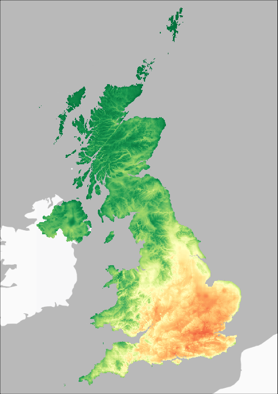
Plant Heat Stress
The Plant Heat Stress Indicator is the count of the number of days in a year when the maximum temperature is above 25°C.
This value is considered as indicator of when crops in general may experience heat stress that may affect growth and implies additional water requirements.
The actual level of heat stress will vary between crops and availability of water and canopy cooling by transpiration.
Calculation: count of days when Tmax > 25°C
Means for two Observed and two Future Projection Periods
1961-1990 Average
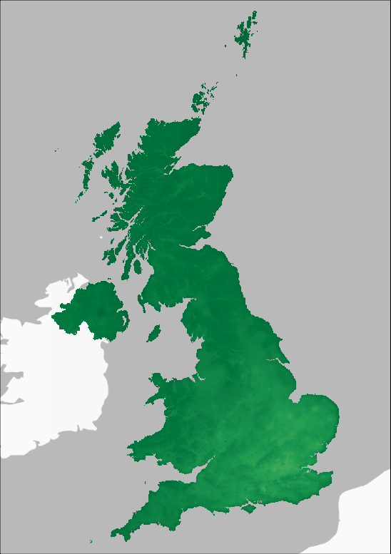
1991-2020 Average
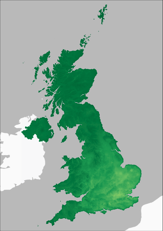
2021-2050 Average
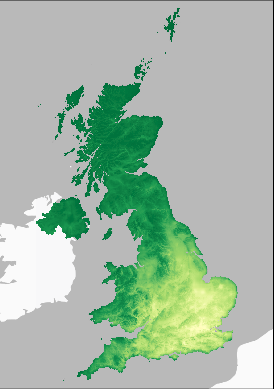
2051-2080 Average